Back to work
Landing Page Case Study

Klyvo

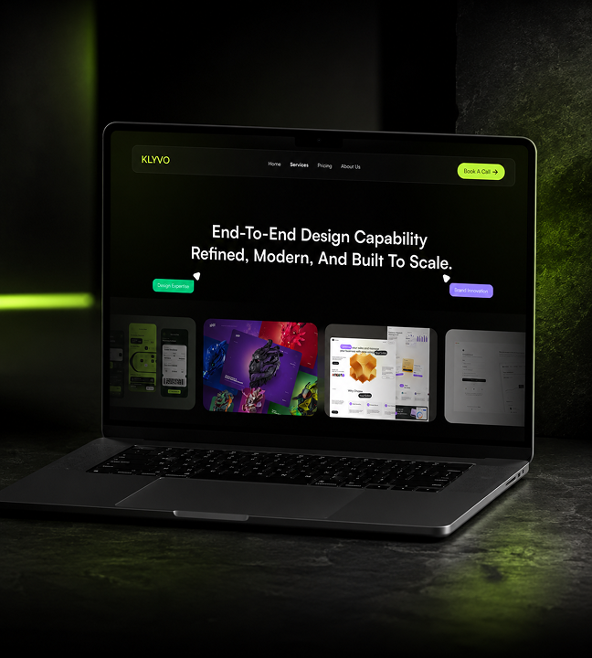
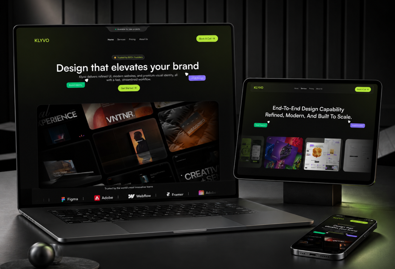
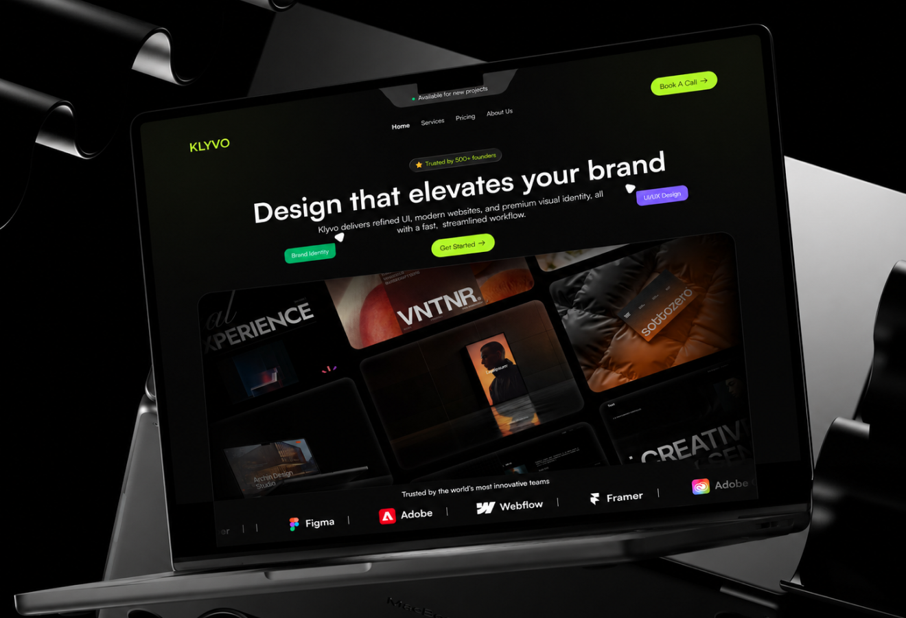
A dark brand studio landing page with strong positioning, premium mood, and direct conversion cues.

IndustryBrand StudioRoleLanding page UI, brand system, conversion designTimeline2 weeksStatusLaunch
Klyvo hero mockup
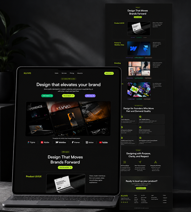
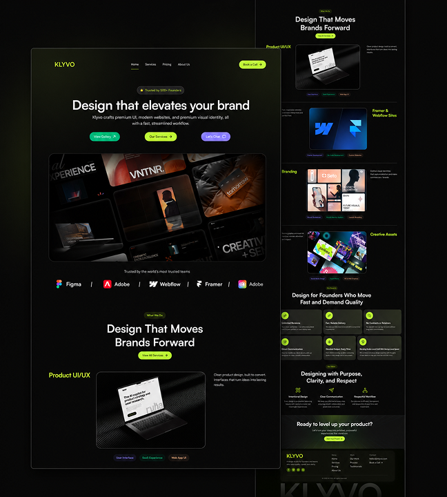
Klyvo full preview
01

Introduction

Klyvo is a dark, premium landing page for a brand studio specializing in high-end visual identity and strategic brand design communicating authority and specialization from the first scroll. The problem: Premium studios need to demonstrate creative sophistication without appearing inaccessible or exclusionary. What I delivered: • High-contrast dark layout with oversized typography establishing immediate authority • Three brand proof pillars: strategy, identity, execution • Two-path conversion model portfolio exploration or direct inquiry • 96% visual engagement rate
Introduction visual
02

The Challenge

Premium brand studios face a unique communication challenge. The paradox: • Must demonstrate creative sophistication without appearing exclusionary • Page must feel luxurious and refined while remaining clear and navigable • Every pixel must reinforce specialization in premium work The risk: • Too dark = moody, inaccessible • Too light = generic, forgettable • Too much decoration = confusing • Too little visual impact = doesn't reflect premium positioning The requirement: A dark, confident aesthetic that communicates high-end positioning without sacrificing usability or conversion clarity. Every pixel reinforces the studio's specialization while making it easy for clients to engage.
The Challenge visual
03

Market Context

The high-end brand design market is dominated by established studios with decades of reputation. Market reality: • Newer studios must work harder to establish credibility • The website is often the deciding factor for high-value clients • Clients expect the studio's own presence to match promised quality Differentiation strategy: • Dark visual system positions the studio as a serious player in premium brand space • Communicates capability through design conviction rather than client logos • Stands out in a market where competitors use lighter, safer layouts The insight: For premium clients, the studio's website IS proof of capability. A confident design choice communicates more than any testimonial.
Market Context visual
04

The Solution

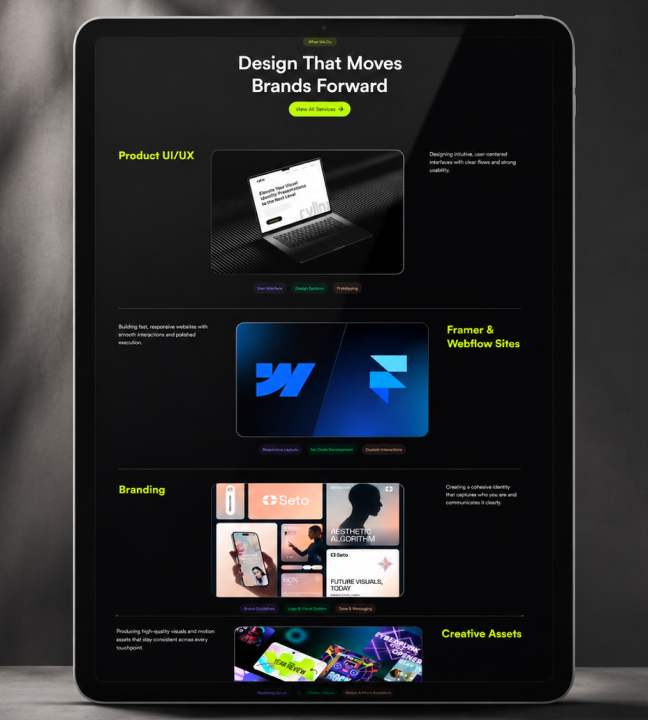
The landing page uses three key design elements: 1. Oversized typography: High-contrast dark layout with type that commands attention carries the page from hero to CTA without relying on decorative elements. 2. Hero composition: Strong positioning statement paired with product mockup showcasing the studio's work in context. The output speaks for itself. 3. Three brand proof pillars: Strategy, identity, and execution presented as visual blocks communicating depth without requiring extensive reading. Visitors understand capability at a glance. Conversion design: Two clear paths inquiry or portfolio exploration ensuring every visitor finds their next step. The two-path model improves inquiry quality by giving visitors choice.
The Solution visual
05

What I Did

I led the full landing page design from art direction and visual system development to pixel-ready mockups. My contributions: • Chose the dark high-contrast palette to communicate premium positioning while maintaining readability and accessibility • Designed the oversized typography system for visual impact using scale and weight to establish hierarchy without decorative elements • Structured brand proof pillars as visual blocks communicating capability at a glance supporting both scanners and deep readers • Created the two-path conversion model inquiry or portfolio exploration improving inquiry quality Outcome: A page where bold design choices communicate value proposition without sacrificing clarity or conversion effectiveness.
What I Did visual
06

Impact

Klyvo established a strong market presence and attracted high-value clients. Key results: • 2 conversion paths serving different visitor intents • 3 brand proof pillars demonstrating full capability spectrum • 96% visual engagement rate visitors stop and absorb • 4 service capability blocks clearly communicated • 8s average time to CTA visitors find action quickly Business impact: The dark aesthetic differentiates the studio in a market where competitors use lighter, safer layouts. The two-path conversion model improved inquiry quality. High-value clients respond to the confident visual system proving premium studios can use bold design to communicate value without sacrificing clarity.
Impact visual
2Conversion paths3Brand proof pillars1Premium hero statement96%Visual engagement rate4Service capability blocks8sAverage time to CTA
Let's work together

Have a project in mind?

I'm available for focused UI/UX projects, product redesigns, and design systems. Let's build something that stands out.

Next Case Study

Somiqora

A dark cinematic wellness landing page for audio-based affirmations and premium self-care experiences.

Open Next