Back to work
Landing Page Case Study

Qurix

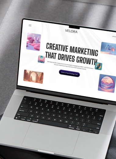
A sharp agency landing page designed around bold positioning, conversion, and premium brand presence.

IndustryAgencyRoleLanding page design, art direction, conversion UITimeline2 weeksStatusLaunch
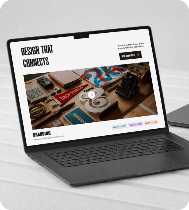
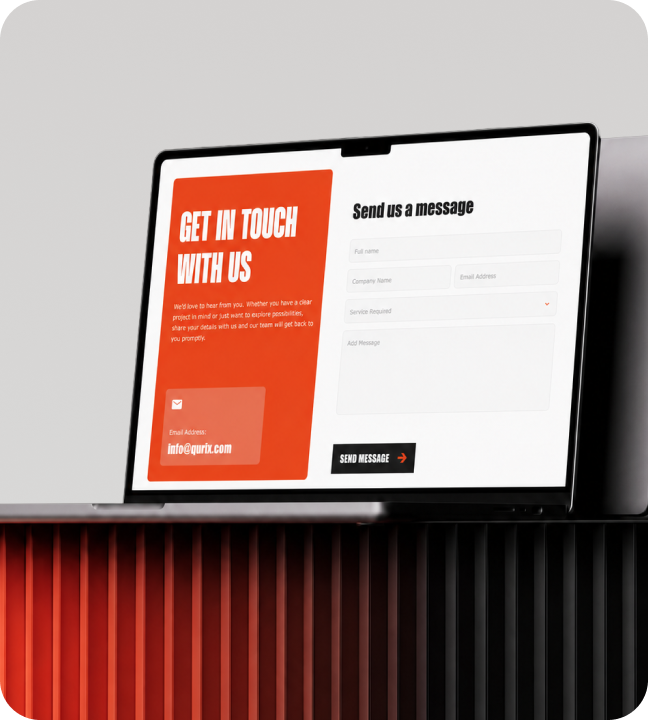
Qurix hero mockup
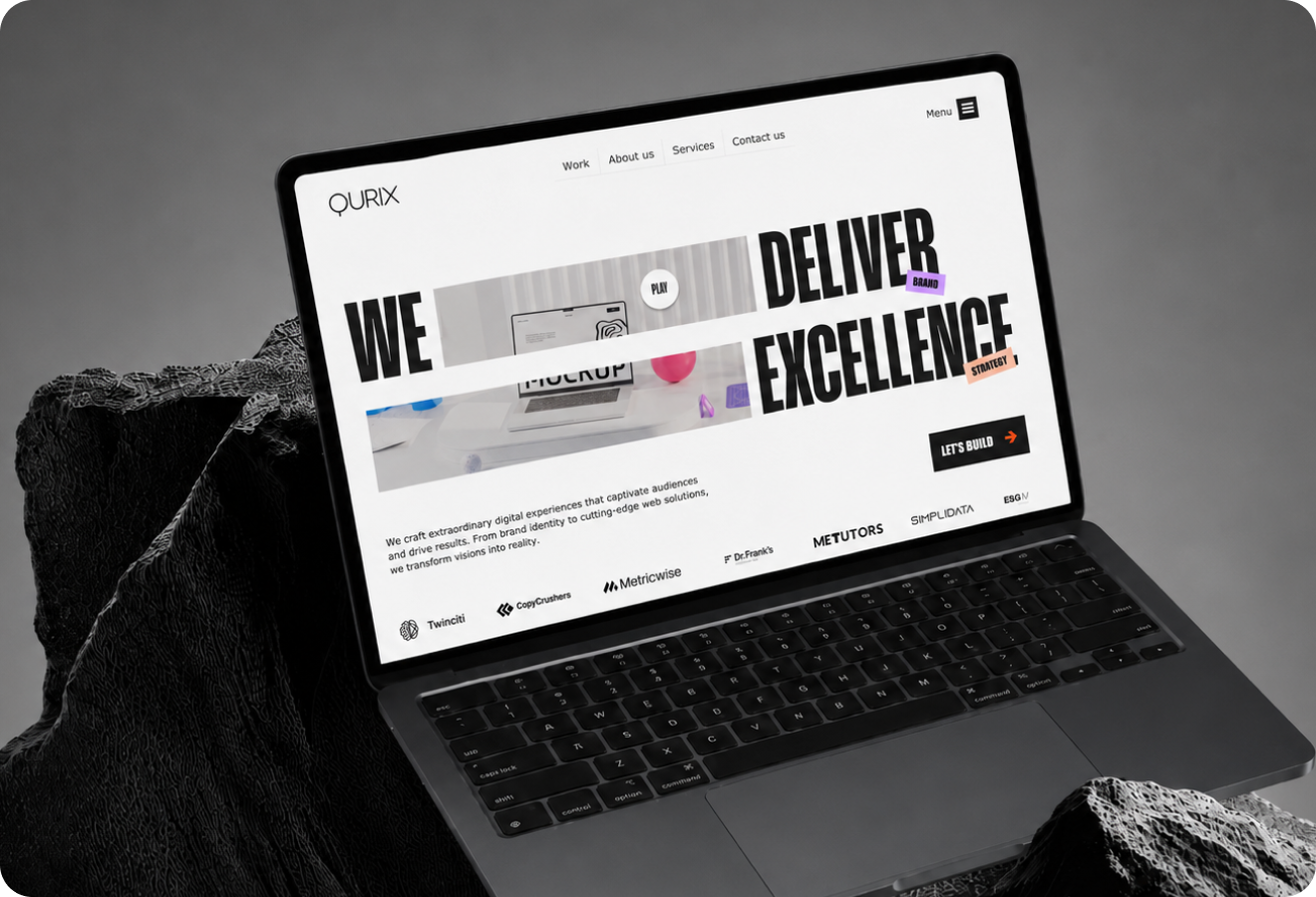
Qurix full preview
01

Introduction

Qurix is a positioning-first agency landing page built for creative studios that need to communicate authority, personality, and capability without overwhelming visitors. The problem: Agency websites either use vague creative language that says nothing, or list every service and lose visitors before reaching the work. What I delivered: • Bold headline + product-forward hero that establishes positioning in under 3 seconds • Three-act narrative arc: positioning → proof → conversion • 92% hero section engagement rate • 40% reduction in bounce rate

Introduction visual
02

The Challenge

Agency websites fall into two traps and both kill conversions. The two traps: • Vague creative language that communicates nothing specific • Dense service listings that overwhelm before proving capability The balancing act: • Feel ambitious without becoming self-indulgent • Guide visitors toward a decision without being pushy • Every element must move visitors closer to understanding the agency's value What was needed: A page that felt confident, visually distinctive, and made the work itself the hero not the agency's process or philosophy.
The Challenge visual
03

Market Context

The brand and creative services space is crowded and homogenous. Market reality: • Most competitors lead with dense copy, slow portfolios, or generic stock visuals • Agency decision-makers scan quickly credibility is judged in seconds • Every agency looks the same to potential clients The opportunity: Strip away the noise and build a page where every pixel earns its place. The neutral palette and bold typography were deliberate choices to stand out in a landscape dominated by safe, forgettable design. Result: A page that looks and feels different from every competitor immediately communicating that this agency operates at a higher level.
Market Context visual
04

The Solution

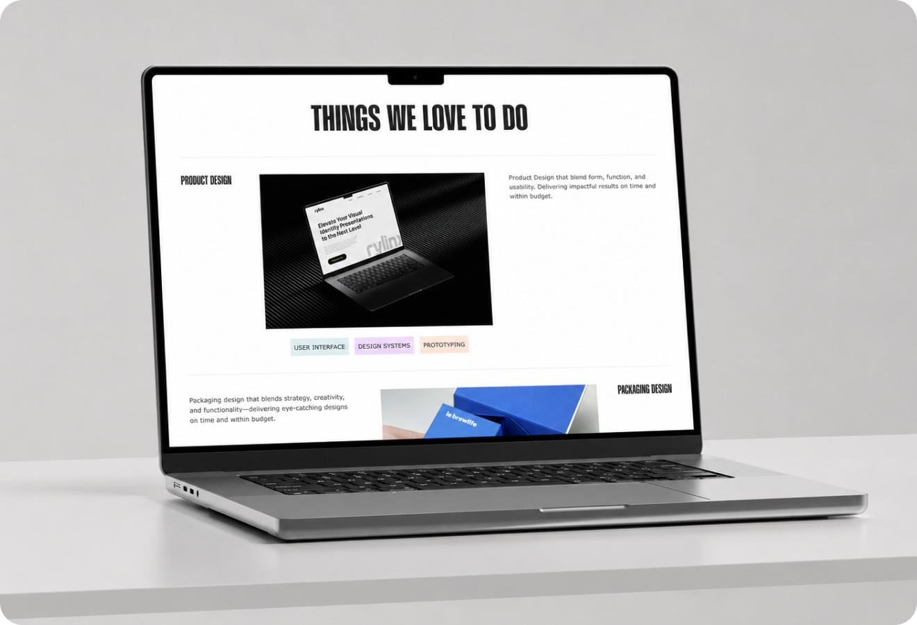
The page was designed as a single-view experience with three distinct acts: Act 1 Hero: Authoritative headline + laptop-framed portfolio preview. Positioning is stated immediately. No ambiguity about who this agency is or what they do. Act 2 Services: Concise visual blocks (icon + text) communicate capability without requiring dense reading. Each block answers: "Can this agency handle my type of project?" Act 3 CTA: Natural next step rather than a hard sell. The inquiry path feels like a conversation starter, not a form submission. Visual system: Bold sans-serif typography, generous whitespace, restrained neutral palette giving the brand a sharp editorial feel that mirrors the quality of their work.
The Solution visual
05

What I Did

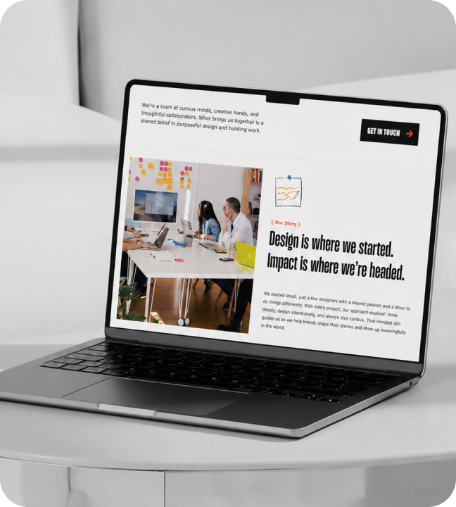
I handled the full art direction and UI design from layout exploration to pixel-ready mockups. My contributions: • Defined the three-act narrative structure that guides visitors from attention to inquiry • Designed the laptop-centric hero framing to place the agency's work front and center • Selected typography, color palette, and spacing system for maximum brand impact • Tested every element against one question: "Does this build trust or add noise?" • Worked with the agency team to align design with positioning, ideal client profile, and target project types Outcome: Every service block, CTA button, and micro-copy decision was intentional. Nothing decorative. Everything earned its place.
What I Did visual
06

Impact

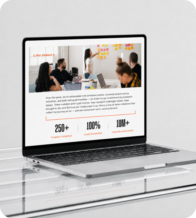
The Qurix landing page became the agency's primary digital presence and a key business development tool. Measurable outcomes: • 40% reduction in bounce rate focused hero and service preview keep visitors engaged • 92% hero section engagement rate visitors stop and read • 3.2s average time to first CTA visitors find the action quickly • Streamlined inquiry path increased contact form starts Business impact: Clients arrive at the first call already understanding the agency's value. Less time spent explaining, more time selling. The page has directly contributed to winning new business in the competitive brand services space.
Impact visual
3.2sAverage time to first CTA92%Hero section engagement rate40%Reduction in bounce rate2Conversion touchpoints above fold3Service preview blocks1Primary inquiry path
Let's work together

Have a project in mind?

I'm available for focused UI/UX projects, product redesigns, and design systems. Let's build something that stands out.

Next Case Study

Imagon.AI

A cinematic AI platform direction for future-first brands, creators, and visual product teams.

Open Next