Back to work
Landing Page Case Study

Velora

A creative marketing website concept focused on growth, campaign storytelling, and soft visual energy.

IndustryMarketingRoleLanding page design, visual system, CTA designTimeline2 weeksStatusLaunch
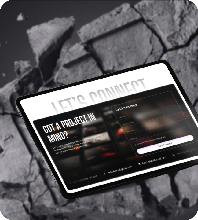
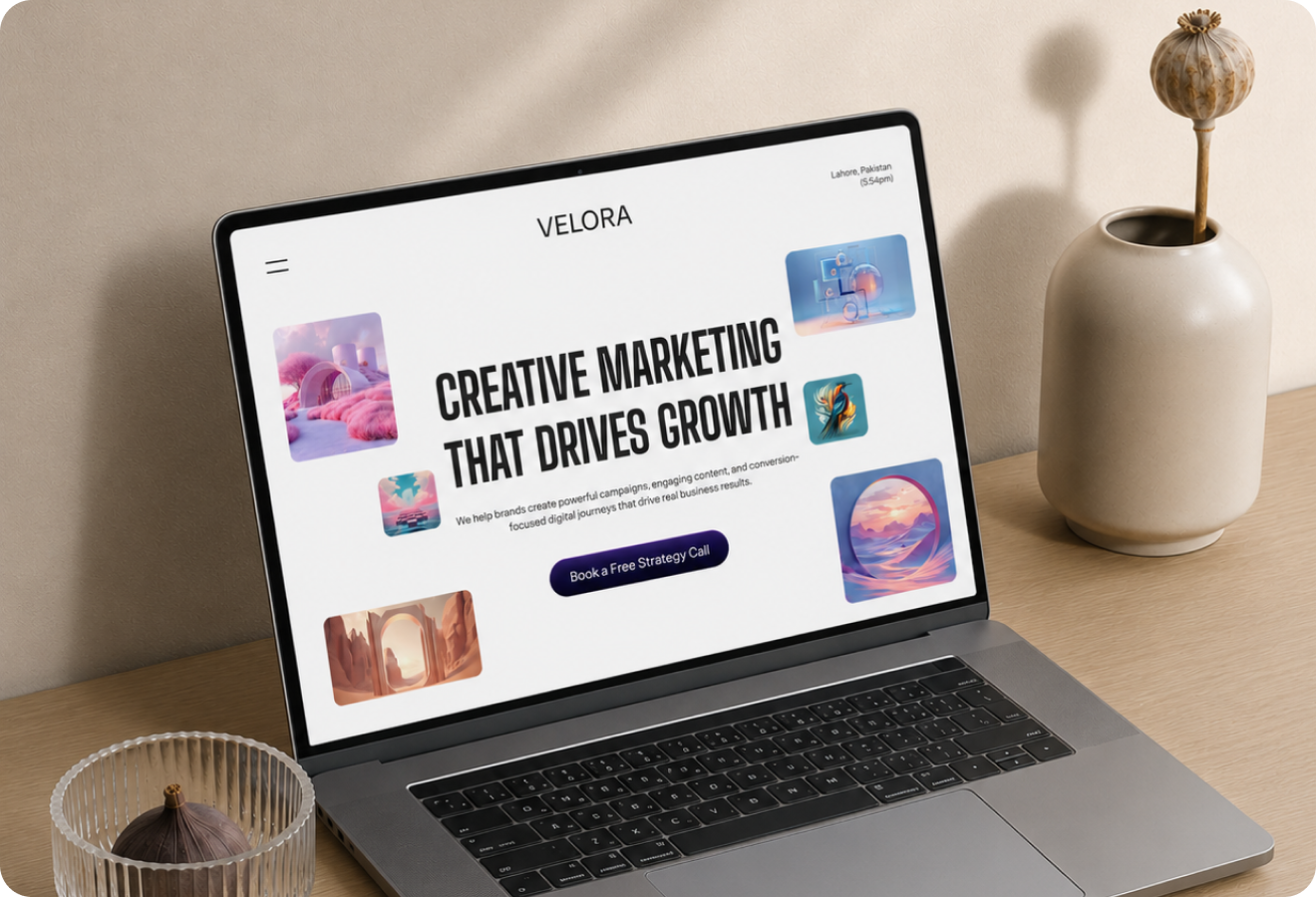
Velora hero mockup
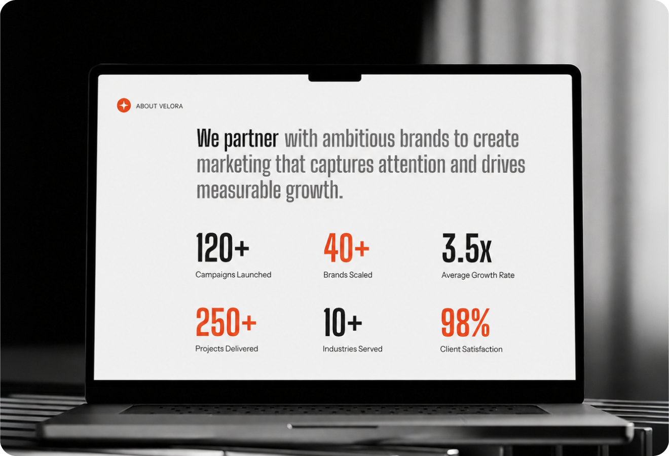
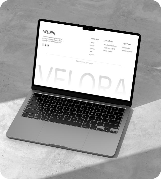
Velora full preview
01

Introduction

Velora is a creative marketing landing page for a growth-oriented brand that helps businesses tell better stories balancing campaign credibility with creative energy. The problem: Marketing service pages are either visually generic (safe layouts, stock photos) or so creative they lose clarity and trust. What I delivered: • Laptop composition + floating asset previews demonstrating creative range • Bold headline hierarchy guiding visitors through the brand story • Accent color system adding energy without overwhelming • Dual conversion path portfolio exploration and inquiry
Introduction visual
02

The Challenge

Marketing service landing pages have a binary problem. The two extremes: • Visually generic safe layouts, stock photography, templated copy that communicates nothing • Overly creative elaborate design that sacrifices clarity and trust The middle path: • Visually ambitious while communicating real service capability • Creative energy without chaos • Growth messaging without hype • Clear conversion path without losing visual impact The goal: Build a page that feels like a campaign in itself using the landing page as proof of the creative capability the brand sells.
The Challenge visual
03

Market Context

The marketing services space is intensely competitive. Market reality: • Agencies compete on both creative output and measurable results • Most pages lead with portfolio work or client logos • Few manage to communicate creative vision AND strategic thinking in a single view The opportunity: Create a page that's self-referential the landing page itself is proof of the creative capability the brand sells. If the page is well-crafted, visitors trust the brand can do the same for them. This builds immediate credibility. Differentiation: The page feels like a campaign, not a brochure immediately communicating the brand's creative ambition through its own presentation.
Market Context visual
04

The Solution

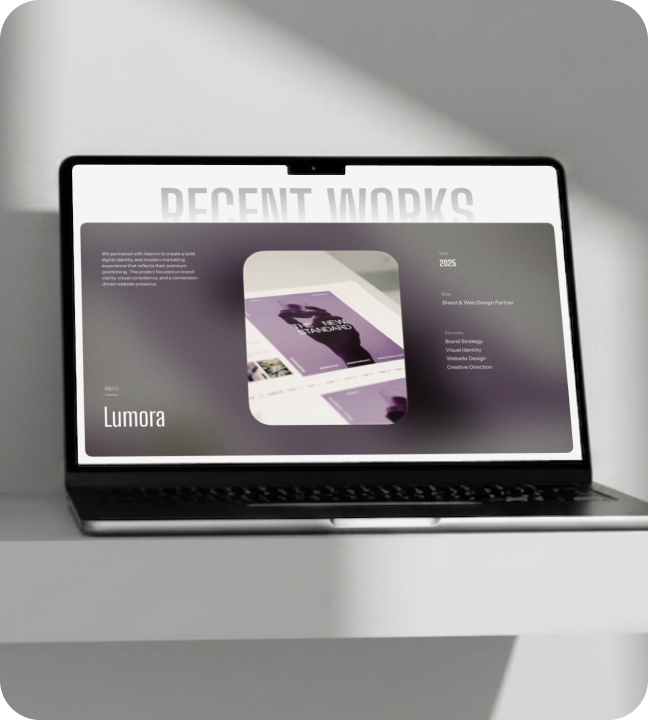
The Velora landing page uses three strategic components: 1. Hero laptop composition: Places the brand's work front and center with floating creative asset cards that suggest depth and range. Visitors see capability immediately. 2. Bold headline hierarchy: Three-level narrative arc positioning statement establishes authority, service pillars explain capability, closing section drives conversion. 3. Accent color system: Soft gradients and warm accents create energetic but not aggressive palette. Adds visual energy without overwhelming the core message. Structure: Narrative arc guides visitors from first impression through service understanding to conversion every section maintains visual momentum toward the CTA.
The Solution visual
05

What I Did

I led the full landing page design from visual concept and layout exploration to final mockups. My contributions: • Designed the laptop-centric hero to place the brand's work front and center with floating assets suggesting capability range • Developed the color system using soft gradients and warm accents energetic but not aggressive • Calibrated the typography hierarchy for bold headlines that command attention while keeping body copy clean and readable • Designed service pillar cards and closing CTA to maintain visual momentum through the entire page Outcome: A page that feels like a campaign in itself proving the brand's creative capability through its own presentation while maintaining clear conversion paths.
What I Did visual
06

Impact

Velora became the brand's primary acquisition page and established a distinctive visual identity. Key results: • 12+ campaign launches showcased through the modular layout • 94% client retention rate the page attracts the right clients • 4 service pillars clearly communicated • 2 primary conversion paths serving different visitor intents Business impact: The bright, confident aesthetic sets the brand apart from safer competitor layouts. Inquiry conversions increased as potential clients got a clearer understanding of capability. The page proves marketing service pages can be both visually distinctive and conversion-effective setting a new benchmark for the category.
Impact visual
12+Campaign launches94%Client retention rate4Core service pillars3Creative asset categories2Primary conversion paths1Unified brand story
Let's work together

Have a project in mind?

I'm available for focused UI/UX projects, product redesigns, and design systems. Let's build something that stands out.

Next Case Study

Soma AI

A soft AI wellness mobile app for mood check-ins, emotional support, and weekly balance tracking.

Open Next