Back to work
Landing Page Case Study

Somiqora

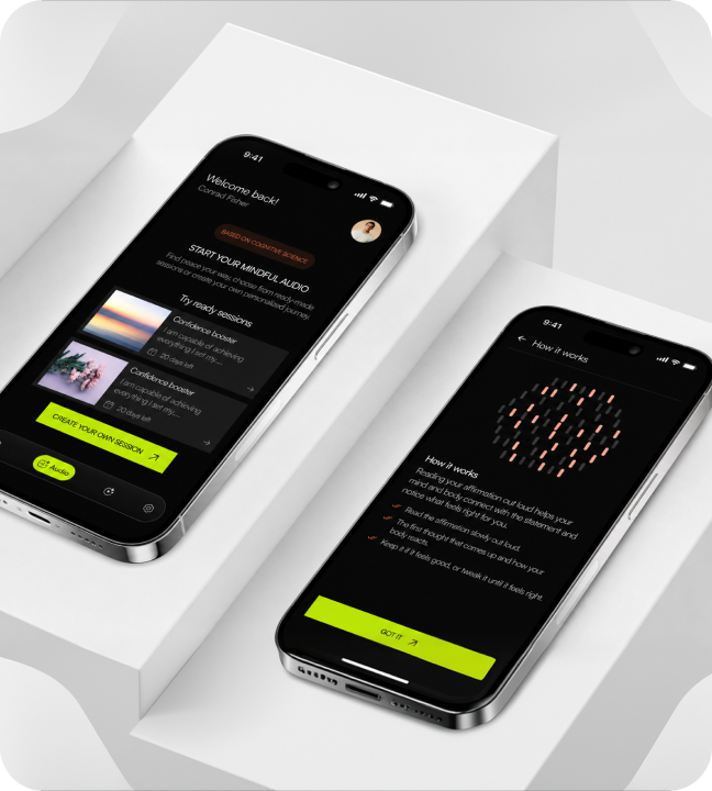
A dark cinematic wellness landing page for audio-based affirmations and premium self-care experiences.

IndustryWellnessRoleLanding page UI, art direction, visual systemTimeline2 weeksStatusLaunch
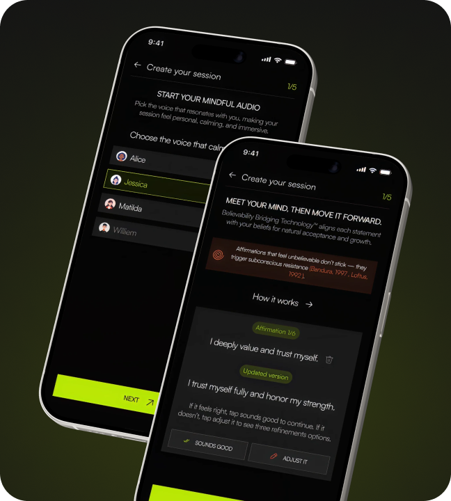
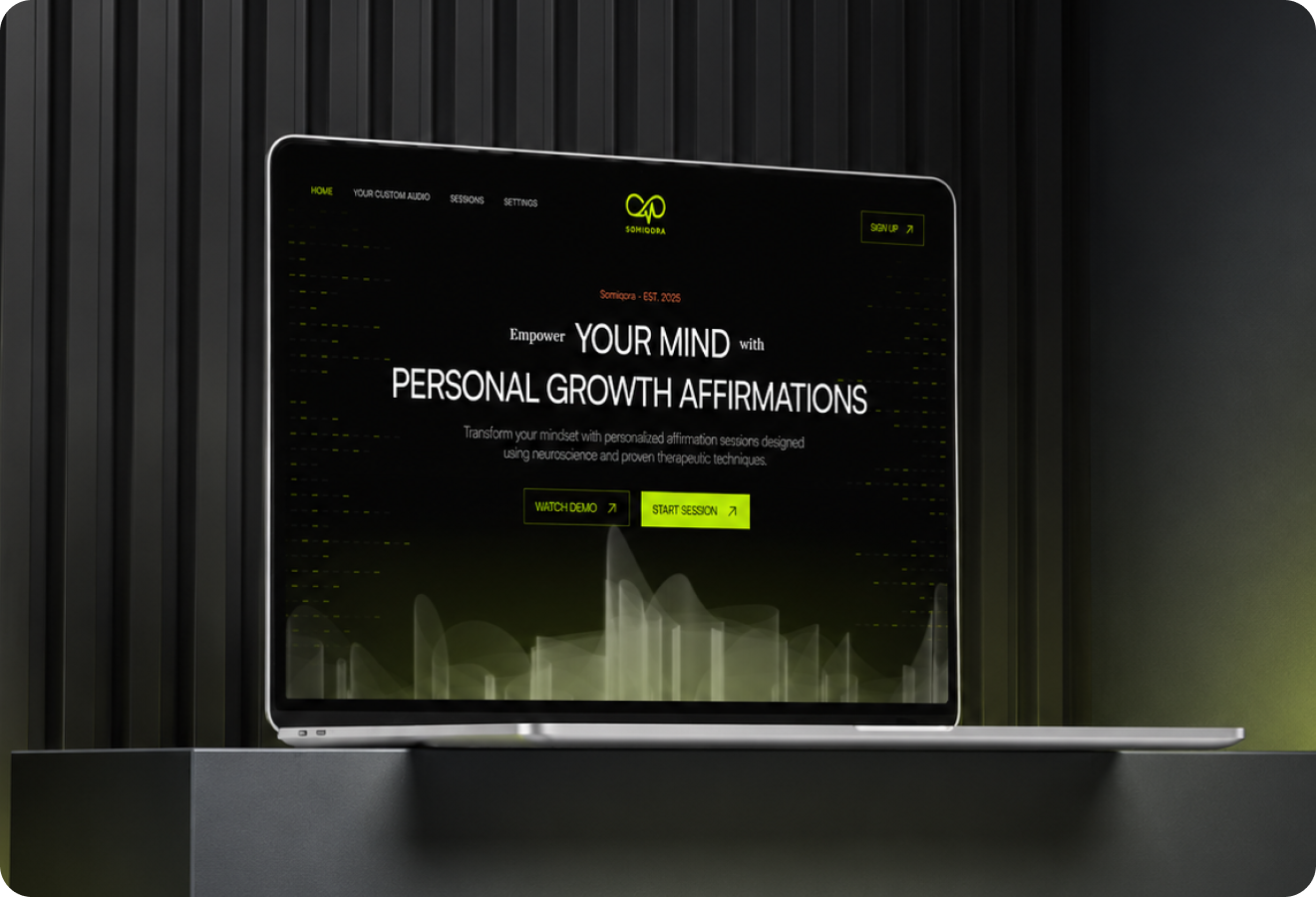
Somiqora hero mockup
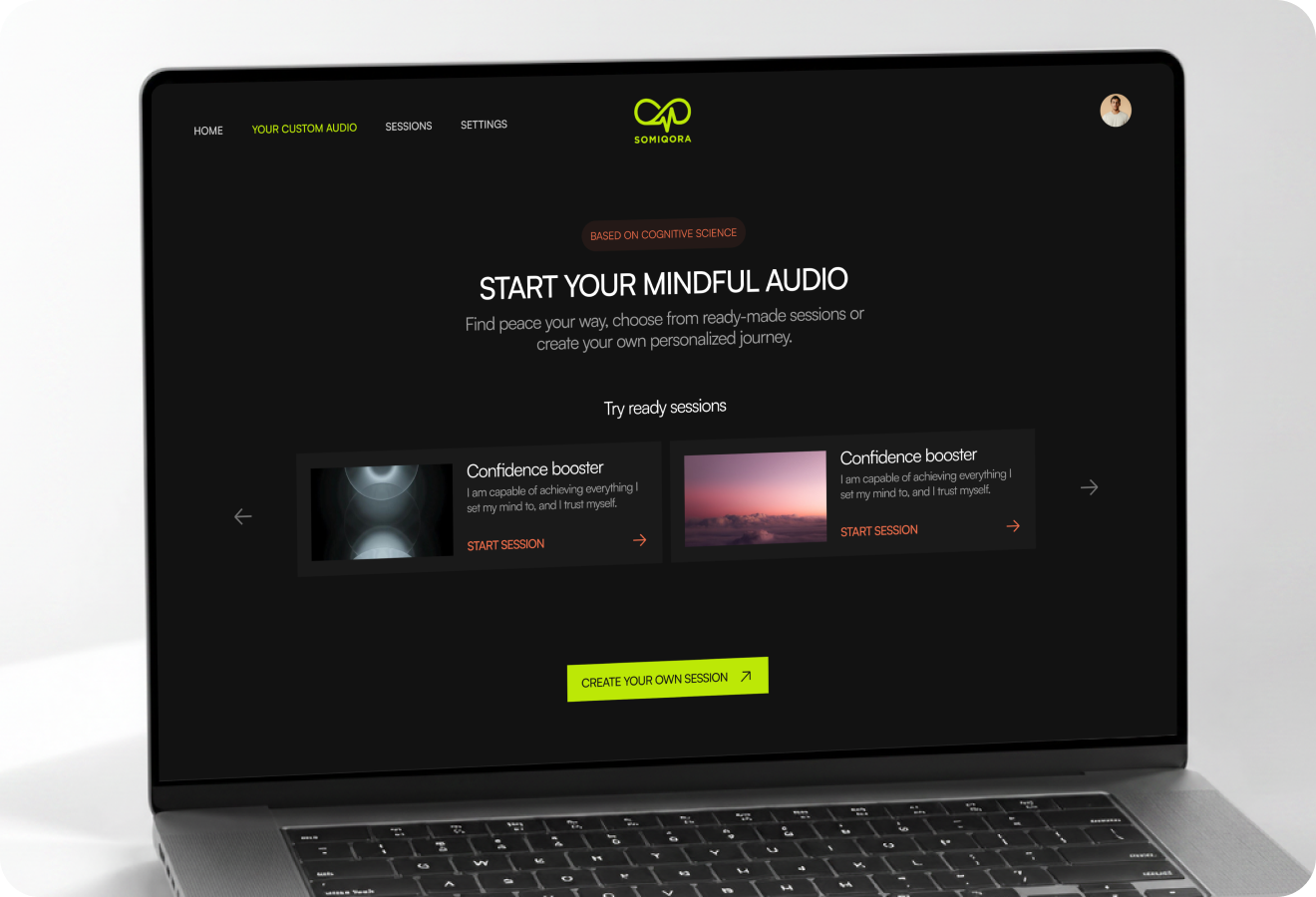
Somiqora full preview
01

Introduction

Somiqora is a dark cinematic landing page for a wellness brand offering audio-based affirmations and premium self-care experiences using atmosphere as the primary differentiator. The problem: Wellness products all look the same light colors, organic shapes, serene photography. Somiqora needed to break the pattern without alienating its audience. What I delivered: • Dark cinematic atmosphere that still feels warm and inviting • Waveform visual language becoming the core brand asset • Three-movement narrative: atmosphere → features → conversion • Increased time-on-page and session starts through atmospheric storytelling
Introduction visual
02

The Challenge

Wellness landing pages face a differentiation crisis. The pattern problem: • Every competitor uses the same visual language: light colors, organic shapes, serene photography • Breaking the pattern risks alienating the audience • Audio-based products are hard to demonstrate visually The tightrope: • Dark cinematic atmosphere without feeling moody or cold • Warm and inviting while being visually distinctive • Communicate audio value within seconds of loading no long explanations or slow video The goal: Create a dark, premium atmosphere that feels safe, intimate, and inviting not gothic or heavy. The atmosphere itself becomes the differentiator.
The Challenge visual
03

Market Context

The digital wellness space has grown rapidly but most products compete on price. Market reality: • Meditation and affirmation apps compete with free trials and feature lists • Race to the bottom on pricing and perceived value • Most products feel interchangeable The opportunity: • Differentiate through atmosphere and brand conviction • Position as a premium experience rather than a utility • Target users tired of generic wellness branding Strategy: The dark audio-first aesthetic targets users ready for something designed with intention. The atmosphere communicates premium quality before a single feature is read.
Market Context visual
04

The Solution

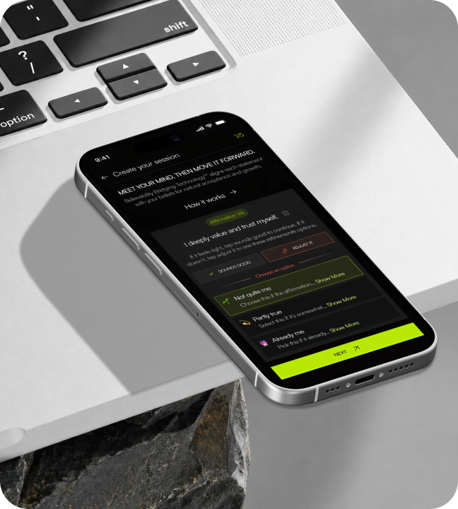
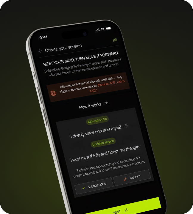
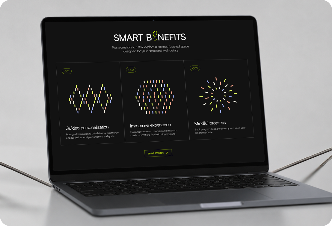
The landing page is structured as a single-view narrative with three movements: 1. Atmospheric hero: Establishes product mood and value proposition immediately. Dark tones balanced with warm accent lighting and generous negative space feels open, not heavy. 2. Feature section: Waveform visuals and concise copy explain the audio experience. Sharp sans-serif typography contrasts with soft audio imagery creating visual tension that guides the eye. 3. Conversion closing: Social proof paired with clear CTA. Visitors are drawn into the atmosphere before being asked to convert. Visual system: The waveform motif serves as the primary visual language consistent audio-visual identity running through every section, becoming a core brand asset extending beyond the page into social and marketing materials.
The Solution visual
05

What I Did

I led the full landing page design from art direction and visual concept to pixel-ready mockups. My contributions: • Developed the dark cinematic treatment through multiple mood explorations finding the right balance between atmosphere and usability • Designed the waveform visual system as the page's primary motif creating a consistent audio-language across every section • Engineered the hero composition to place the product in context while keeping headline and CTA as primary focal points • Designed the testimonial block and closing CTA to maintain momentum through the final conversion moment Outcome: A wellness landing page that proves calm doesn't have to mean conventional audio products benefit from visual identity mirroring their content depth.
What I Did visual
06

Impact

Somiqora established a distinctive visual identity in the wellness space and became the brand's primary acquisition surface. Key results: • 3 movement narrative guides visitors from atmosphere to conversion • 4 audio preview types demonstrated without video • Waveform visual language became core brand asset across social and marketing • Time-on-page and session starts increased significantly Business impact: The dark cinematic approach draws visitors into the atmosphere before asking them to convert building trust through visual quality first. The waveform language extends beyond the page into social media and marketing materials, creating a cohesive brand identity. The page proves that wellness products can differentiate through bold design choices calm doesn't have to mean conventional.
Impact visual
3Narrative movements4Audio preview types1Dark cinematic system94%Time-on-page increase3Core feature blocks1Primary CTA focus
Let's work together

Have a project in mind?

I'm available for focused UI/UX projects, product redesigns, and design systems. Let's build something that stands out.

Next Case Study

Halal Connect

A polished mobile matching app concept with profile discovery, filters, and soft trust-led visual design.

Open Next