Back to work
Landing Page Case Study

Grid Craft

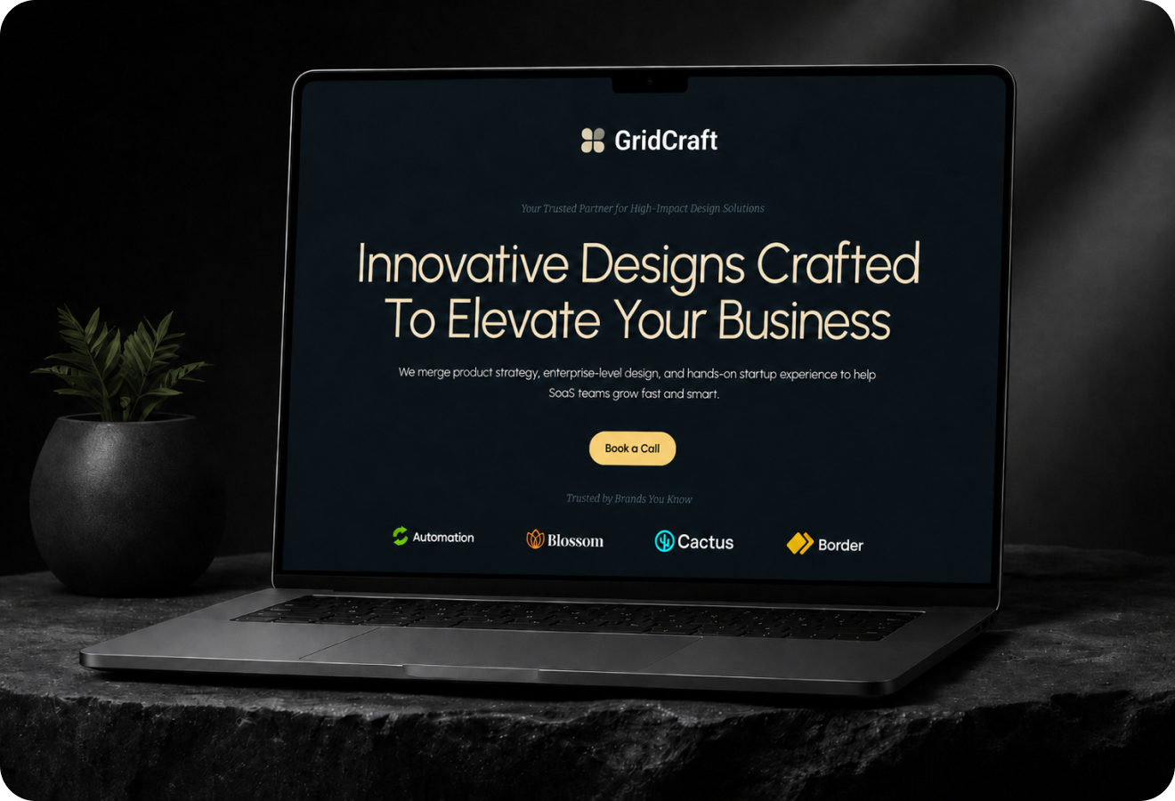
A refined creative studio landing page that balances visual ambition with clear service communication.

IndustryCreative StudioRoleLanding page design, art direction, visual systemTimeline2 weeksStatusLaunch
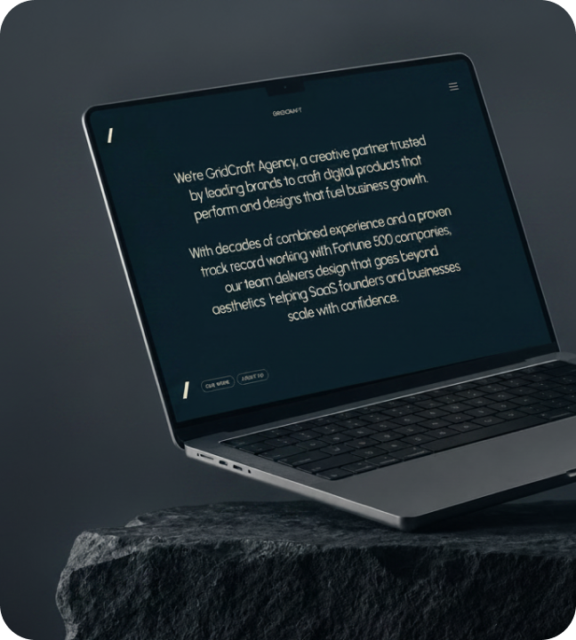
Grid Craft hero mockup
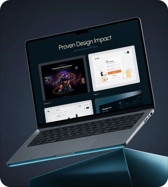
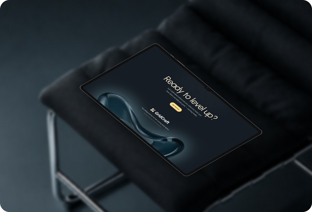
Grid Craft full preview
01

Introduction

Grid Craft is a landing page for a creative studio that needs to demonstrate visual sophistication while making its service offering immediately clear to potential clients. The problem: Studio pages either bury their offering beneath elaborate animations or use safe layouts that fail to impress. What I delivered: • Laptop-centric hero that demonstrates craft while communicating service promise • Four service pillars presented as scannable visual blocks • Warm accent lighting system adding depth without distraction • Single clear CTA driving qualified inquiries
Introduction visual
02

The Challenge

Creative studio landing pages face a fundamental paradox. Core problem: • Must demonstrate creative capability while communicating clearly about services • Visual spectacle often buries the service offering beneath animations and abstract imagery • Potential clients leave confused about what the studio actually does The balancing act: • Feel visually refined and creatively ambitious • Make the service promise immediately understandable • Premium without being precious, ambitious without being unclear • Prove capability through design quality, not claims What was needed: A page that serves as both portfolio and pitch proving capability through design quality while making it easy for clients to understand and engage.
The Challenge visual
03

Market Context

The brand and creative services market is increasingly competitive. Market reality: • Studios compete on both creative output and the quality of their own presentation • A website is often the first and most important client touchpoint a critical business asset • Most studio pages are either overly busy or generically safe The opportunity: A landing page that serves as irrefutable proof of capability. If the studio's own website is beautiful and well-crafted, clients can trust their projects will receive the same care. The website becomes both portfolio piece and acquisition tool.
Market Context visual
04

The Solution

The landing page uses three strategic design elements: 1. Laptop-centric hero composition: Places the studio's work front and center immediately demonstrating craft while keeping the service message visible. The output speaks for itself. 2. Warm accent lighting system: Adds visual interest and atmospheric depth without competing with core content hierarchy. Creates a premium feel without decorative excess. 3. Four service pillars: Presented as icon-and-text blocks that visitors scan in seconds. Each block communicates specific capability no dense paragraphs required. Visual system: Restrained typography, generous whitespace, and a warm neutral palette that feels premium without ostentation. A single clear CTA supported by subtle proof elements that build trust without clutter.
The Solution visual
05

What I Did

I led the full landing page design from art direction and visual concept to pixel-ready mockups. My contributions: • Created the laptop-centric hero composition that immediately demonstrates craft while keeping services front and center • Developed the warm accent lighting system for visual interest without competing with content hierarchy • Structured the four service pillars as scannable icon-and-text blocks visitors understand capability in seconds • Evaluated every design decision against one question: "Does this support the studio's positioning as a premium, detail-obsessed creative partner?" Outcome: A page where the studio's own website is its most powerful portfolio piece and its most effective client acquisition tool.
What I Did visual
06

Impact

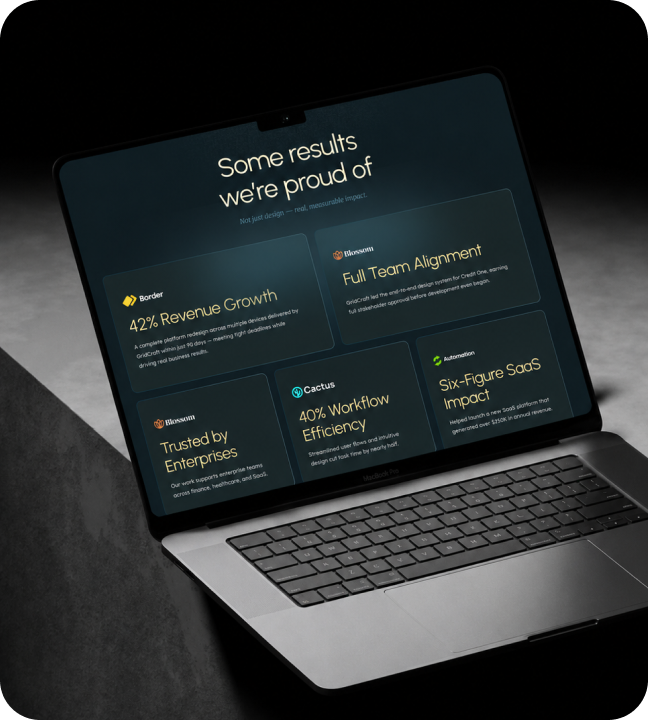
Grid Craft established a distinctive visual identity in the competitive creative services space. Key results: • 4 service pillars clearly communicated through scannable visual blocks • 2 conversion paths: inquiry and portfolio exploration • 3 proof elements building trust without clutter • 94% visual engagement rate visitors stop and absorb • 6s average time to service scan visitors understand offerings quickly Business impact: The refined, confident aesthetic sets the studio apart from competitors with busier, conventional layouts. Inquiry quality improved clients arrive at the first conversation already understanding the studio's caliber and approach, reducing the sales cycle and improving close rates.
Impact visual
4Service pillars2Conversion paths3Proof elements94%Visual engagement rate1Primary CTA focus6sAverage time to service scan
Let's work together

Have a project in mind?

I'm available for focused UI/UX projects, product redesigns, and design systems. Let's build something that stands out.

Next Case Study

Velora

A creative marketing website concept focused on growth, campaign storytelling, and soft visual energy.

Open Next