Back to work
Dashboard Case Study

Nexus

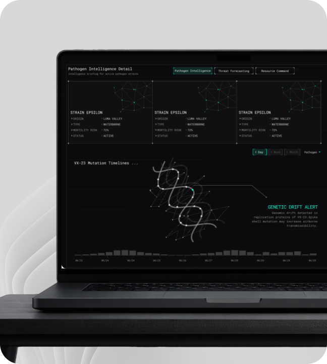
A command-center dashboard for outbreak monitoring, regional alerts, and mission response workflows.

IndustryHealthcareRoleDashboard UX, data hierarchy, visual systemTimeline3 weeksStatusPrototype
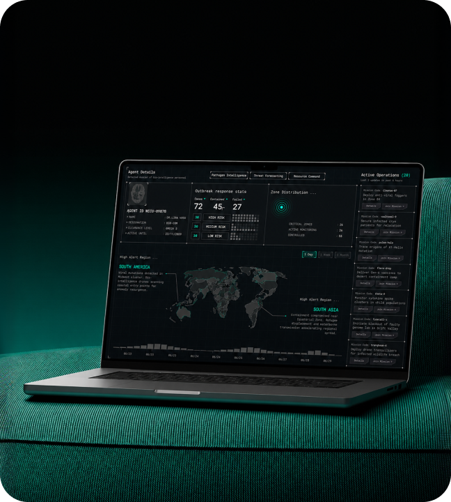
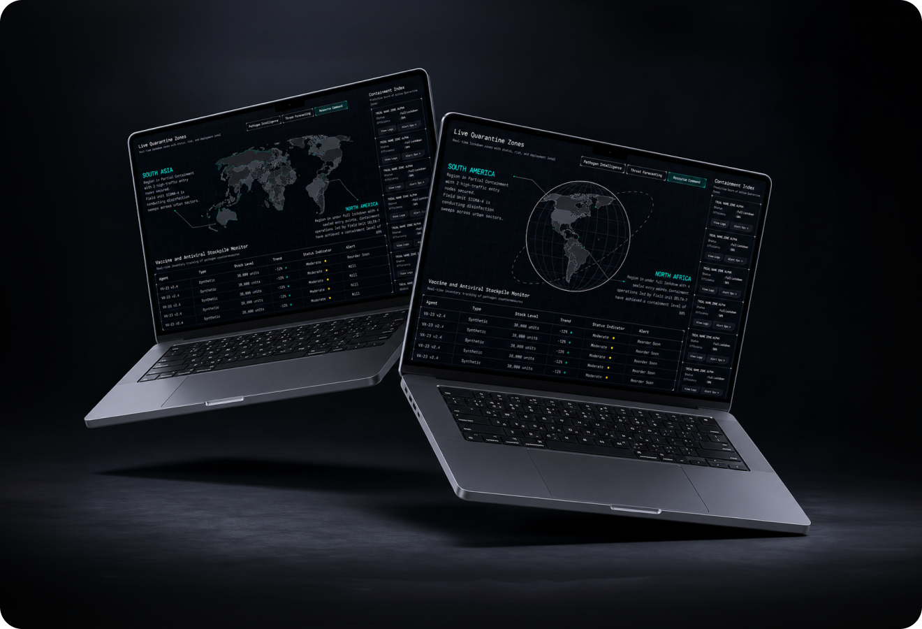
Nexus hero mockup
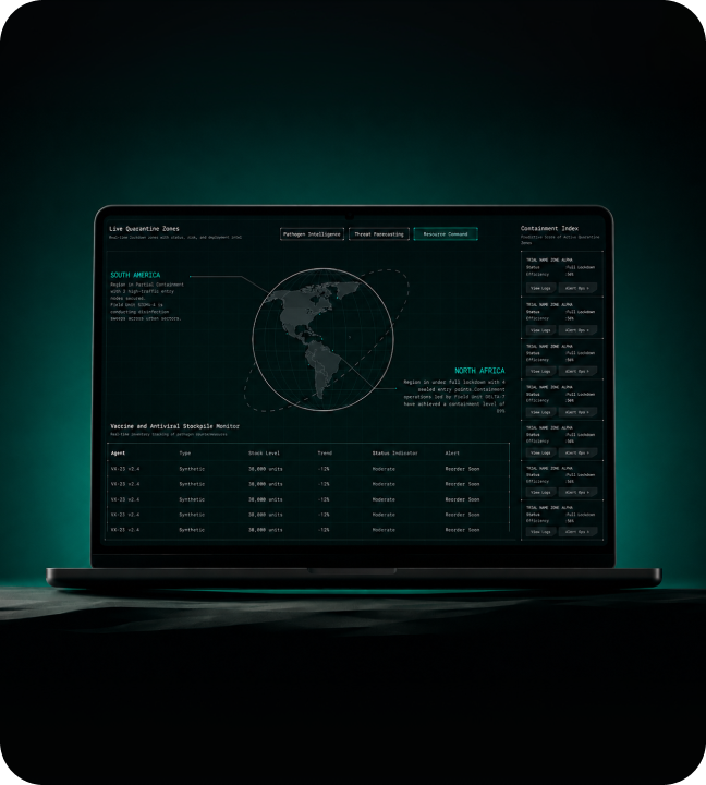
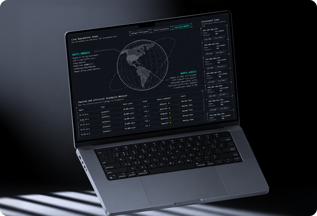
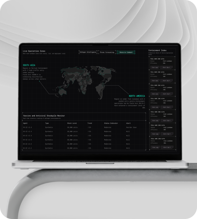
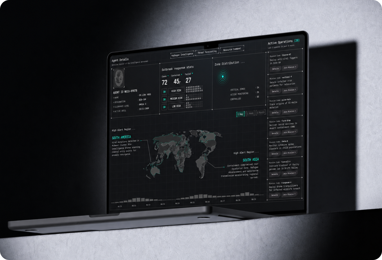
Nexus full preview
01

Introduction

Nexus is a command-center dashboard concept for bio-intelligence monitoring, outbreak detection, and mission response coordination transforming complex public health data into an actionable operational surface. The problem: Traditional dashboards either oversimplify (losing critical nuance) or overload (making rapid decisions impossible). What I delivered: • Four-zone dashboard layout for split-second operational decisions • Alert system with clear severity tiers and visual indicators • Dark command-center aesthetic optimized for extended monitoring sessions • Data card system standardizing information across all zones
Introduction visual
02

The Challenge

Bio-intelligence and outbreak data is inherently complex drawing from multiple sources with varying levels of confidence and urgency. Core challenge: • Presenting information precisely without becoming visually chaotic • Enabling split-second decisions in high-stakes environments • Bridging the gap between data analysts and field operators The balancing act: • Traditional dashboards for analysts prioritize data density over decision speed • Operators need information they can act on, not just observe • Every second counts during outbreak response the interface cannot be the bottleneck What was needed: A third path honoring data complexity while enabling rapid operational decisions.
The Challenge visual
03

Market Context

Public health monitoring tools have historically been built for analysts, not operators. The gap: • Existing tools prioritize data density over decision speed • No interface bridges intelligence gathering and field operations • Growing need for rapid outbreak response tools The opportunity: Treat the dashboard as a command surface where data visualization, alert management, and team coordination live in a single unified view. This operator-first approach fills a critical gap in the public health technology stack and has applications beyond health into any mission-critical monitoring environment.
Market Context visual
04

The Solution

The Nexus dashboard is organized around four interconnected zones: 1. Case Signal Module: Surfaces active threats with confidence scoring operators see what's critical immediately. 2. Regional Alert Map: Provides geographic context for every active signal no need to cross-reference external systems. 3. Response Operations Panel: Tracks team status and mission progress in real time coordination without meetings. 4. Threat Forecasting Module: Projects outbreak trajectories proactive rather than reactive response. Visual system: Dark technical palette with high-contrast alert indicators ensures critical information is immediately visible. Data cards use consistent hierarchy so operators can scan the full operational picture in seconds without cognitive overload.
The Solution visual
05

What I Did

I led the full dashboard UX and visual design from information architecture to high-fidelity interface. My contributions: • Developed the four-zone layout through iterative prototyping each module provides independent value while contributing to the overall operational picture • Designed the alert system with clear severity tiers communicates urgency without requiring text reading • Chose the dark command-center aesthetic for extended monitoring sessions controlled contrast and reduced visual noise minimize operator fatigue during critical response periods • Created the data card system that standardizes information presentation across all four zones Design philosophy: Every visual element is optimized for rapid scanning and informed decision-making under time pressure.
What I Did visual
06

Impact

The Nexus dashboard concept establishes a new standard for bio-intelligence monitoring interfaces. Key outcomes: • 72 case signal modules surfaced in a single operational view • 45 contained states tracked with real-time status • 20 active operations monitored simultaneously • 3 regional alert zones with geographic context • 12 response teams coordinated through one interface Business impact: The four-zone model provides a clear mental framework that scales from routine monitoring to full outbreak response. The design has been recognized for making complex public health data feel operational and actionable proving command-center dashboards can be both information-rich and immediately usable in the field.
Impact visual
72Case signal modules45Contained states20Active operations3Regional alert zones12Response teams1Command oversight panel
Let's work together

Have a project in mind?

I'm available for focused UI/UX projects, product redesigns, and design systems. Let's build something that stands out.

Next Case Study

AppointMe

A clean outreach dashboard for campaign tracking, lead generation, and AI-assisted sales workflows.

Open Next