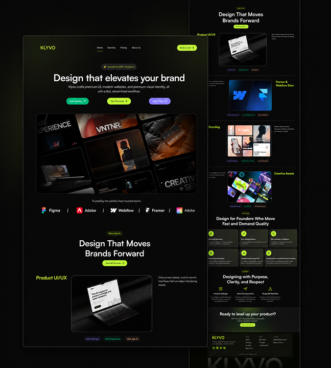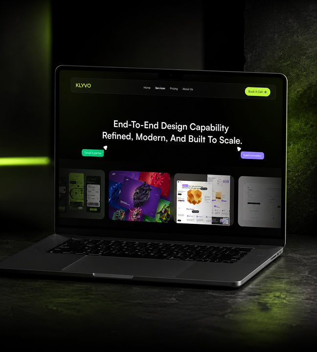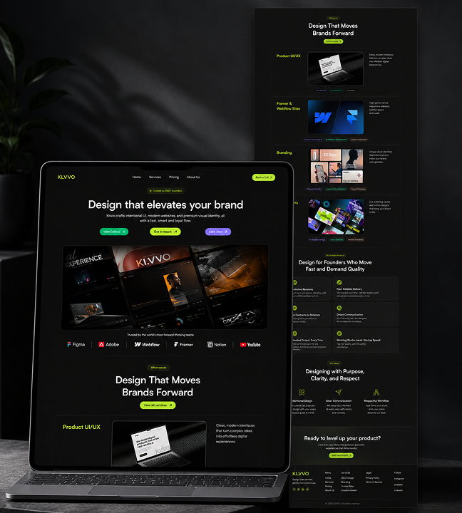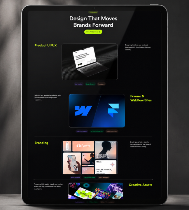

Back to identities
Brand System Case Study

Branding Kit

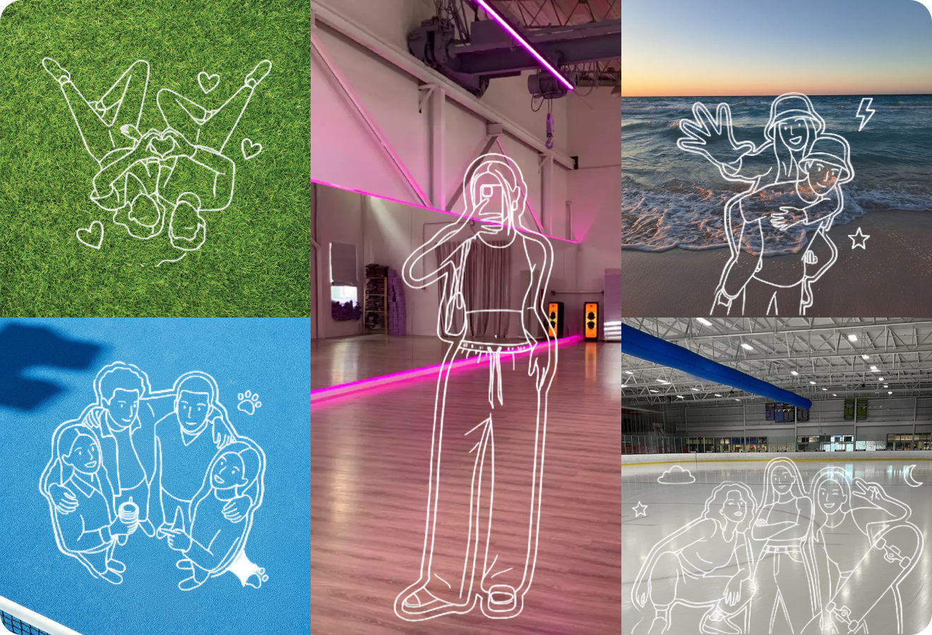
A collection of launch-ready brand kits across KLYVO, Baskit, Habyn, and KLYCK, covering logo systems, typography, color, packaging, apparel, signage, and digital touchpoints.

IndustryBrand IdentityRoleBrand identity, visual system, launch assets, art directionTimelineMulti-brand systemStatusLaunch-ready
Branding Kit hero mockup
Branding Kit full preview
Brand system preview

Identity assets composed for launch, pitch, and product rollout.

Branding Kit brand mockup 2
Branding Kit brand mockup 3
Branding Kit brand mockup 4
01

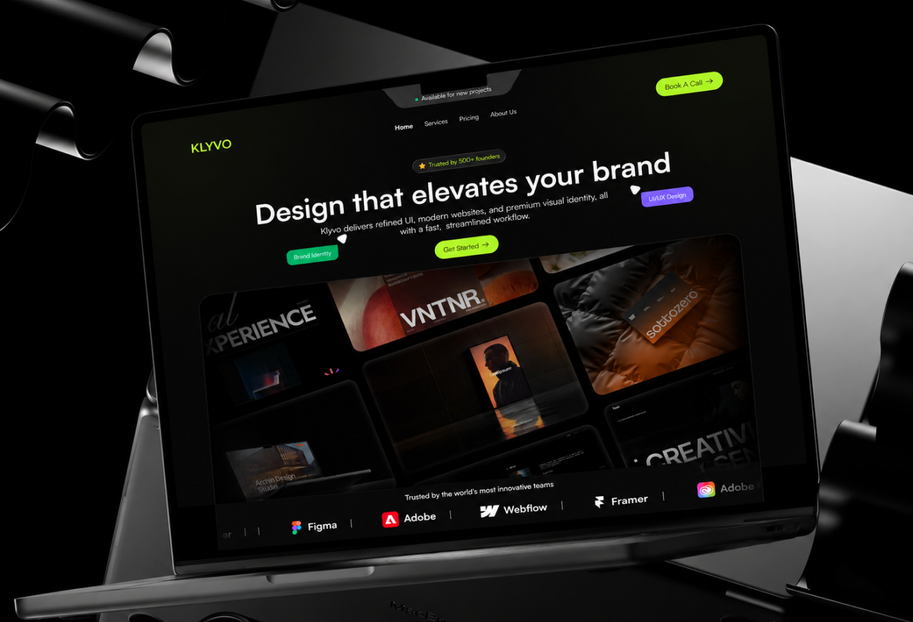
KLYVO Brand System

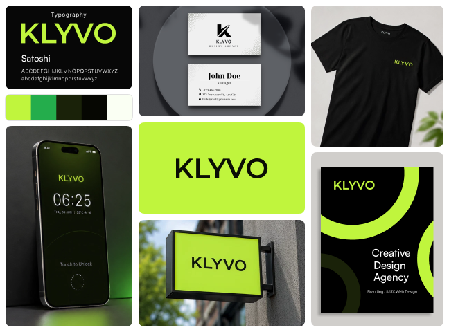
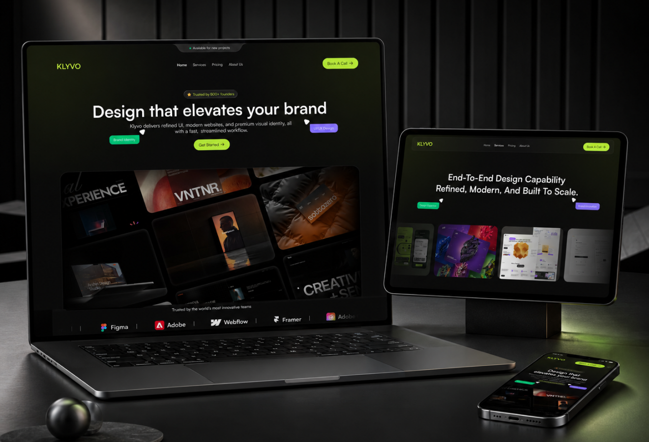
KLYVO is a bold neon identity for a creative agency. The kit establishes the core mark, color direction, typography feel, and visual rules that make the brand recognizable from the first impression. The mockup set presents the identity as a real launch system rather than a single static logo file.
KLYVO Brand System visual
02

KLYVO Identity Applications

The applications show how KLYVO performs across practical surfaces while keeping the same brand behavior intact. This gives the identity enough structure for client presentations, signage, social assets, apparel, and launch collateral.
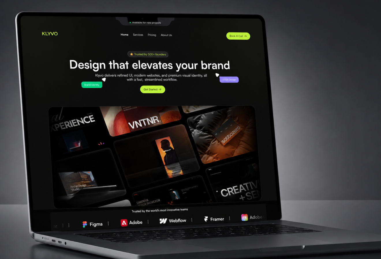
KLYVO Identity Applications visual
03

KLYVO Launch Touchpoints

KLYVO extends into launch touchpoints that founders and product teams can actually use. The goal is to make the brand feel complete, polished, and easy to apply across marketing and product moments.
KLYVO Launch Touchpoints visual
04

KLYVO Presentation Set

The presentation set frames KLYVO with strong hierarchy, clean spacing, and consistent asset usage. Each scene is designed to help the brand feel ready for decks, websites, product previews, and launch campaigns.
KLYVO Presentation Set visual
05

KLYVO Brand Extensions

The extended mockups test how the identity stretches without losing recognition. This keeps KLYVO flexible while preserving the visual cues that make the system memorable.
KLYVO Brand Extensions visual
06

KLYVO Visual Consistency

The repeated elements across the kit create consistency from one touchpoint to the next. That consistency helps KLYVO feel established before launch and easier to trust in client, investor, or customer-facing contexts.
KLYVO Visual Consistency visual
07

KLYVO Final Direction

The final direction packages KLYVO as a launch-ready brand kit with enough depth for digital, physical, and campaign usage. It gives the brand a clear system that can grow beyond the first presentation.
KLYVO Final Direction visual
08

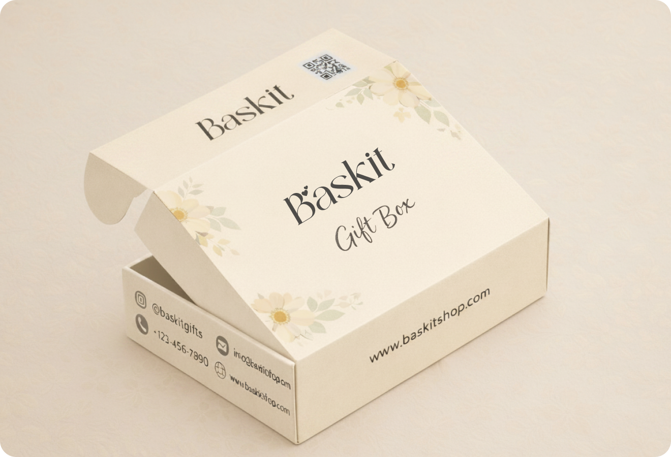
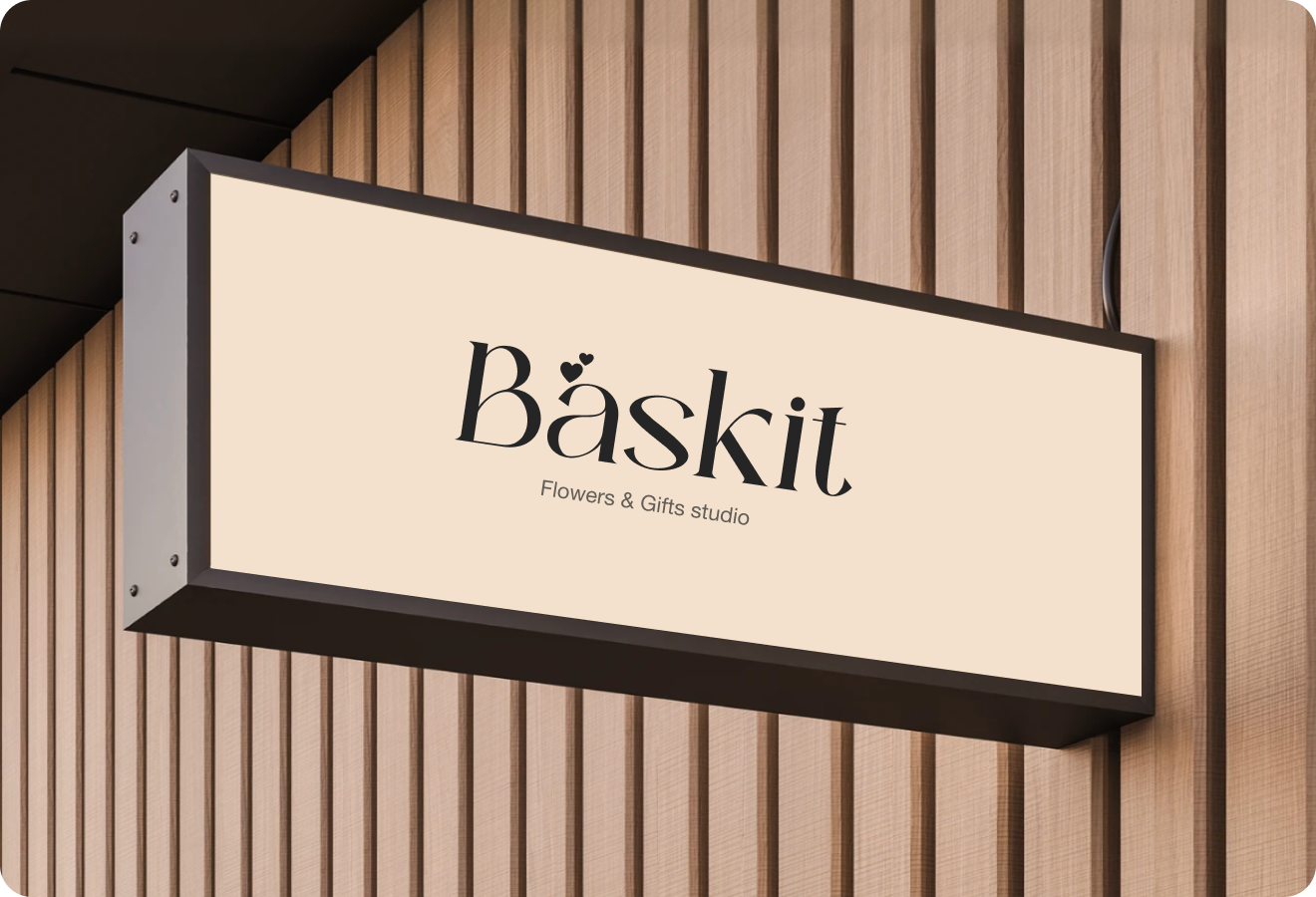
Baskit Brand System

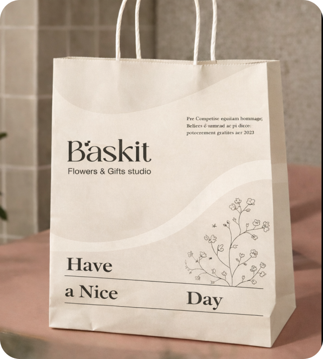
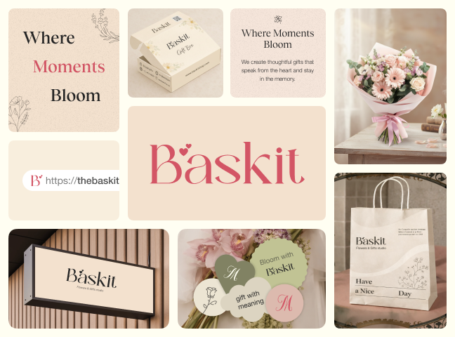
Baskit is a warm retail identity for gifting and floral moments. The kit establishes the core mark, color direction, typography feel, and visual rules that make the brand recognizable from the first impression. The mockup set presents the identity as a real launch system rather than a single static logo file.
Baskit Brand System visual
09

Baskit Identity Applications

The applications show how Baskit performs across practical surfaces while keeping the same brand behavior intact. This gives the identity enough structure for packaging, cards, storefront visuals, social posts, and customer-facing launch assets.
Baskit Identity Applications visual
10

Baskit Launch Touchpoints

Baskit extends into launch touchpoints that founders and product teams can actually use. The goal is to make the brand feel complete, polished, and easy to apply across marketing and product moments.
Baskit Launch Touchpoints visual
11

Baskit Presentation Set

The presentation set frames Baskit with strong hierarchy, clean spacing, and consistent asset usage. Each scene is designed to help the brand feel ready for decks, websites, product previews, and launch campaigns.
Baskit Presentation Set visual
12

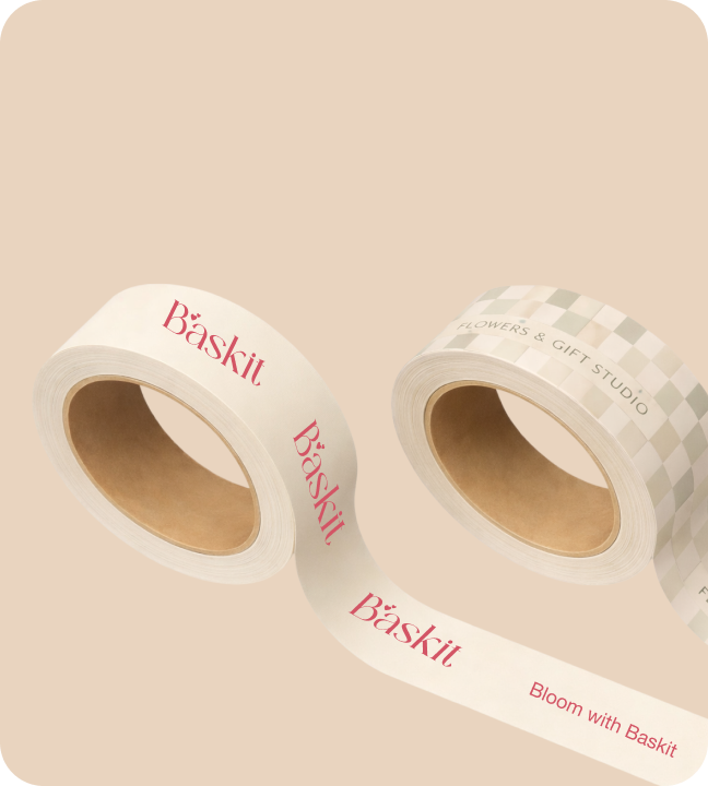
Baskit Brand Extensions

The extended mockups test how the identity stretches without losing recognition. This keeps Baskit flexible while preserving the visual cues that make the system memorable.
Baskit Brand Extensions visual
13

Baskit Visual Consistency

The repeated elements across the kit create consistency from one touchpoint to the next. That consistency helps Baskit feel established before launch and easier to trust in client, investor, or customer-facing contexts.
Baskit Visual Consistency visual
14

Baskit Final Direction

The final direction packages Baskit as a launch-ready brand kit with enough depth for digital, physical, and campaign usage. It gives the brand a clear system that can grow beyond the first presentation.
Baskit Final Direction visual
15

KLYCK Brand System

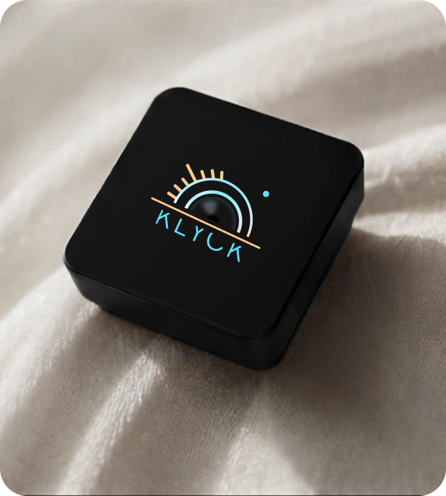
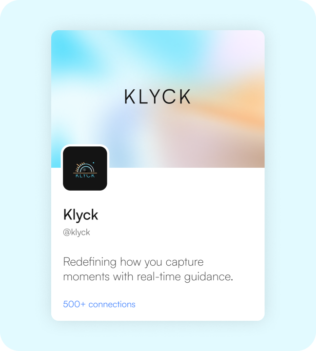
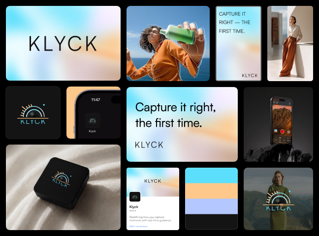
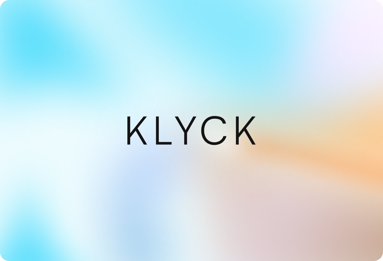
KLYCK is a camera-product identity for a modern mobile app. The kit establishes the core mark, color direction, typography feel, and visual rules that make the brand recognizable from the first impression. The mockup set presents the identity as a real launch system rather than a single static logo file.
KLYCK Brand System visual
16

KLYCK Identity Applications

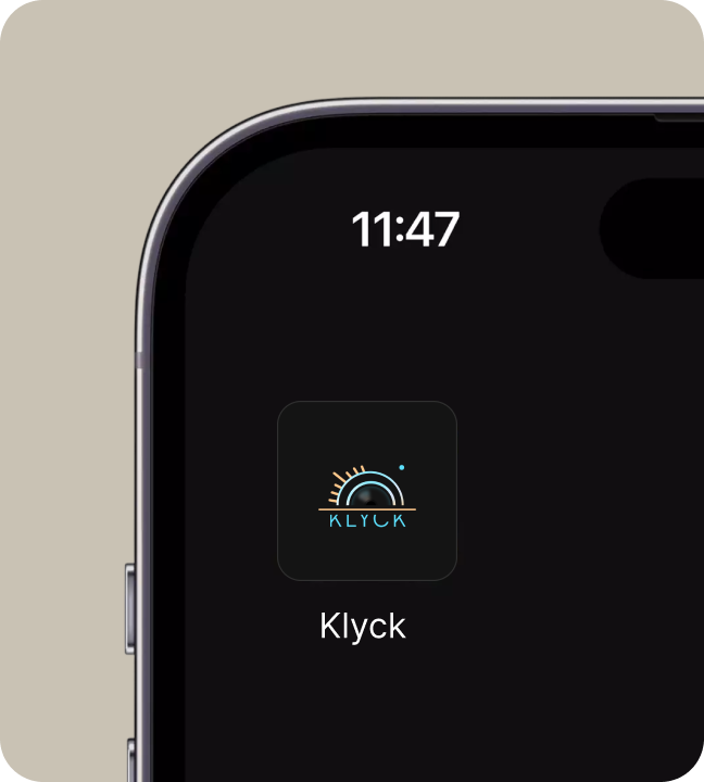
The applications show how KLYCK performs across practical surfaces while keeping the same brand behavior intact. This gives the identity enough structure for app icon presentation, screenshot graphics, pitch visuals, and launch campaigns.
KLYCK Identity Applications visual
17

KLYCK Launch Touchpoints

KLYCK extends into launch touchpoints that founders and product teams can actually use. The goal is to make the brand feel complete, polished, and easy to apply across marketing and product moments.
KLYCK Launch Touchpoints visual
18

KLYCK Presentation Set

The presentation set frames KLYCK with strong hierarchy, clean spacing, and consistent asset usage. Each scene is designed to help the brand feel ready for decks, websites, product previews, and launch campaigns.
KLYCK Presentation Set visual
19

KLYCK Brand Extensions

The extended mockups test how the identity stretches without losing recognition. This keeps KLYCK flexible while preserving the visual cues that make the system memorable.
KLYCK Brand Extensions visual
20

KLYCK Visual Consistency

The repeated elements across the kit create consistency from one touchpoint to the next. That consistency helps KLYCK feel established before launch and easier to trust in client, investor, or customer-facing contexts.
KLYCK Visual Consistency visual
21

KLYCK Final Direction

The final direction packages KLYCK as a launch-ready brand kit with enough depth for digital, physical, and campaign usage. It gives the brand a clear system that can grow beyond the first presentation.
KLYCK Final Direction visual
22

Habyn Brand System

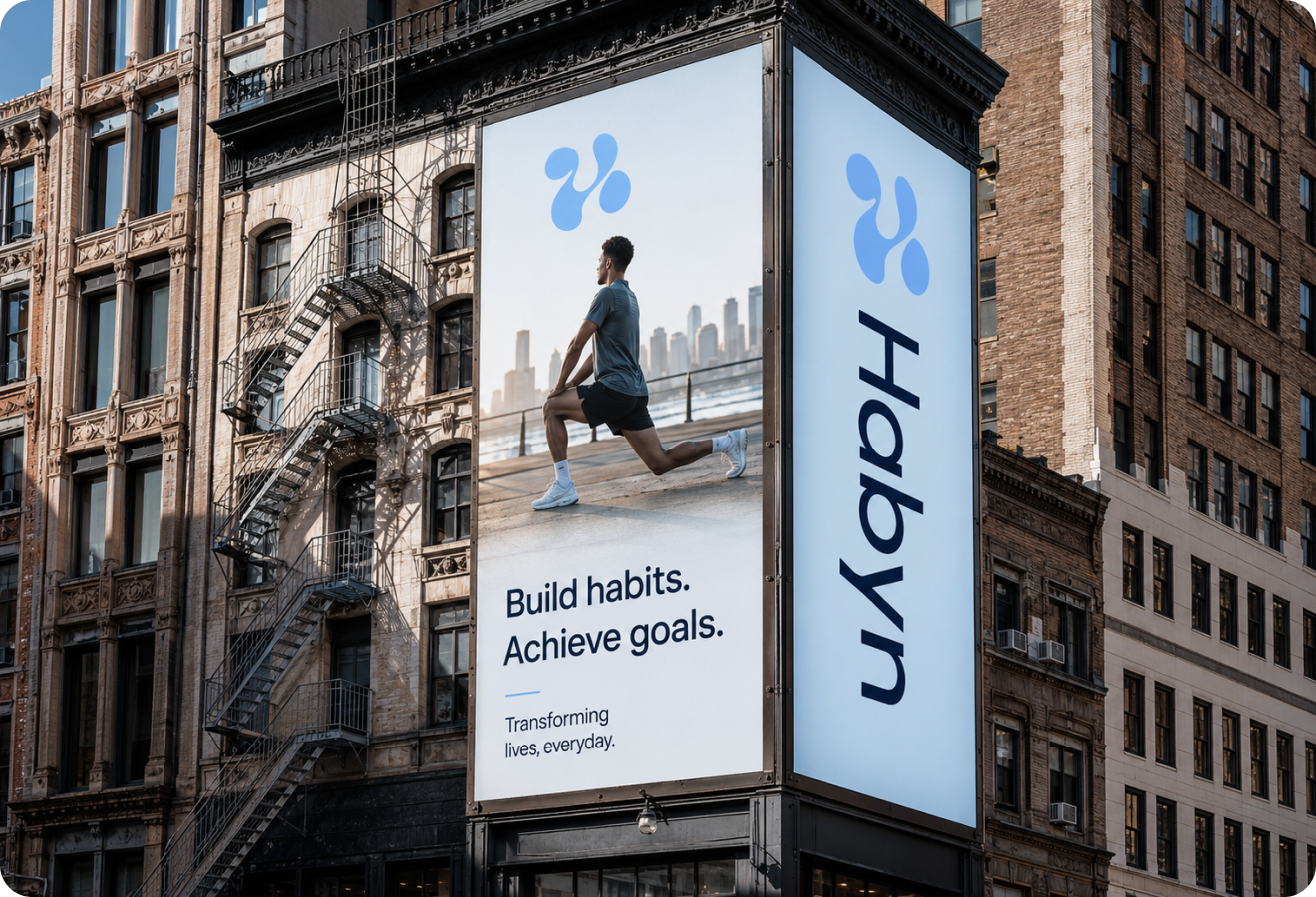
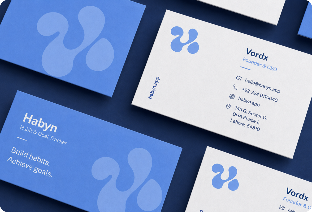
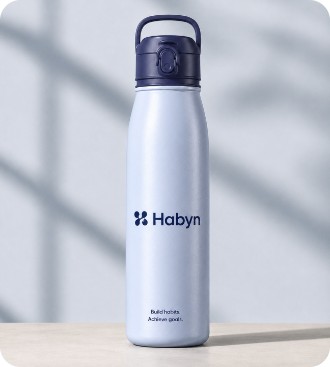
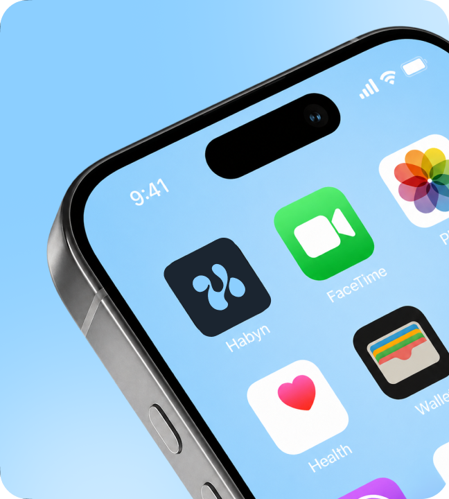
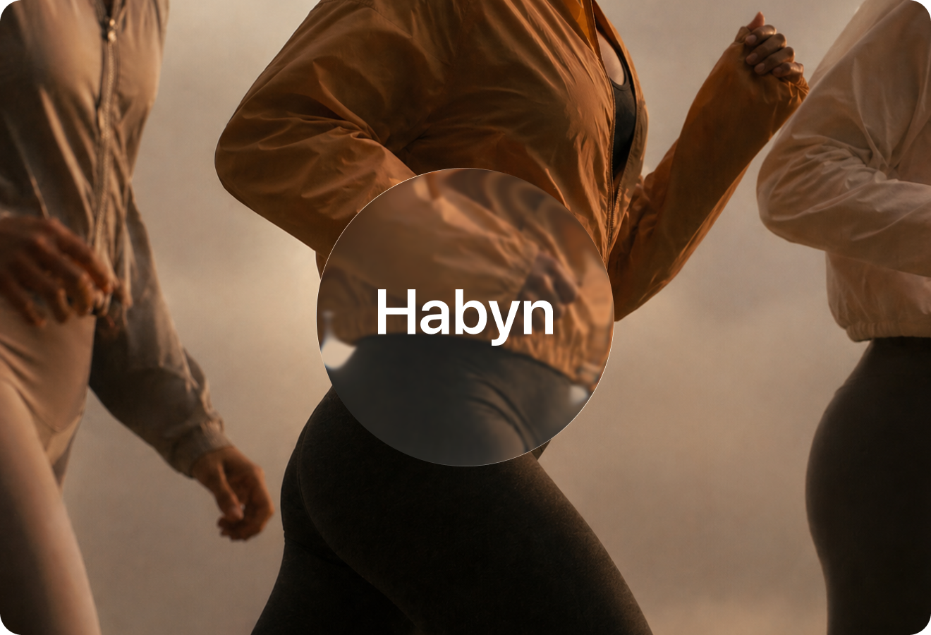
Habyn is a calm blue identity for a habit-building product. The kit establishes the core mark, color direction, typography feel, and visual rules that make the brand recognizable from the first impression. The mockup set presents the identity as a real launch system rather than a single static logo file.
Habyn Brand System visual
23

Habyn Identity Applications

The applications show how Habyn performs across practical surfaces while keeping the same brand behavior intact. This gives the identity enough structure for app icons, apparel, stationery, signage, product marketing, and investor-ready presentation.
Habyn Identity Applications visual
24

Habyn Launch Touchpoints

Habyn extends into launch touchpoints that founders and product teams can actually use. The goal is to make the brand feel complete, polished, and easy to apply across marketing and product moments.
Habyn Launch Touchpoints visual
25

Habyn Presentation Set

The presentation set frames Habyn with strong hierarchy, clean spacing, and consistent asset usage. Each scene is designed to help the brand feel ready for decks, websites, product previews, and launch campaigns.
Habyn Presentation Set visual
26

Habyn Brand Extensions

The extended mockups test how the identity stretches without losing recognition. This keeps Habyn flexible while preserving the visual cues that make the system memorable.
Habyn Brand Extensions visual
27

Habyn Visual Consistency

The repeated elements across the kit create consistency from one touchpoint to the next. That consistency helps Habyn feel established before launch and easier to trust in client, investor, or customer-facing contexts.
Habyn Visual Consistency visual
28

Habyn Final Direction

The final direction packages Habyn as a launch-ready brand kit with enough depth for digital, physical, and campaign usage. It gives the brand a clear system that can grow beyond the first presentation.
Habyn Final Direction visual
4Brand systems28Brand mockup scenes4Launch identities100%Presentation-ready assets6Core identity elements1Scalable brand-kit system
Let's work together

Have a project in mind?

I'm available for focused UI/UX projects, product redesigns, and design systems. Let's build something that stands out.

Next Case Study

App Store Assets

A store-ready launch asset system for mobile apps, covering app icons, screenshot art direction, feature messaging, visual hierarchy, and campaign-ready product graphics.

Open Next